Related styles:
-
REAPER Forum (Cockos.com) - Full Width
Installs:Created: Jan 11, 2009Last Updated: Dec 12, 2010 -
Created: Dec 04, 2011Last Updated: Dec 05, 2011
-
Created: Dec 13, 2007Last Updated: Dec 14, 2007
-
Created: Aug 23, 2014Last Updated: Aug 23, 2014
-
Created: Nov 18, 2013Last Updated: Nov 30, 2013
-
Created: Jan 15, 2013Last Updated: Jan 16, 2013


The Independant.co.uk-More text, no gadgets
Description:
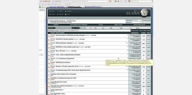
However, since I'm very new to this CSS-, html and what_not stuff, I can't get rid of the 'secondary_column',
marked by those 2 red vertical lines. In reality, you almost don't see them, but still, some people could find
it disturbing. And btw., I'd like to know/learn as well what rules to use, so if someone can help me out....
And please excuse the bad image quality, but it should be enough to just compare/recognise the changes made.
Any comments welcome, and please adjust to taste and screen size.
;)
First install FreeStyler to use this style.
If you already installed it, please, make sure this site is allowed to run JavaScript.But you can download Freestyler for other browsers and apply styles there!
Applies to:
independent.co.uk