Related styles:
-
Created: Nov 25, 2006Last Updated: Nov 26, 2006
-
Created: Nov 24, 2006Last Updated: Nov 25, 2006
-
Created: Nov 24, 2006Last Updated: Nov 25, 2006
-
Created: Nov 24, 2006Last Updated: Nov 25, 2006
-
Created: Nov 24, 2006Last Updated: Nov 27, 2006
-
Created: Nov 25, 2006Last Updated: Nov 26, 2006
-
Created: Nov 26, 2006Last Updated: Nov 28, 2006
-
Created: Apr 05, 2015Last Updated: Apr 05, 2015
-
Created: Nov 22, 2006Last Updated: Nov 23, 2006


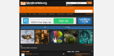
blenderartists.org - layout/colour tweaks
Description:
- The page is centred
- There is a grey background (the post background is still white)
- Posts have an orange top border and a background-colour gap at the bottom for better separation (Based on Gez' suggestion)
- User profiles have a grey background
- User profiles have equal padding all around (no extra padding at the top)
- The header is 50px smaller (the logo is cropped a little at the top and bottom, but I like the reduced space usage)
- The forum control links ("User CP", "New Posts", etc.) have a light grey line above and below them and have even padding above and below
- Headings (e.g. for different categories in the forum listings) are larger and black instead of grey
- The edit box for replying to a thread has a white background
- Posts in the post review when replying to a thread are separated with an orange top border and
First install FreeStyler to use this style.
If you already installed it, please, make sure this site is allowed to run JavaScript.But you can download Freestyler for other browsers and apply styles there!
Applies to:
blenderartists.org