Related styles:
-
Created: May 04, 2009Last Updated: May 11, 2009
-
Created: Apr 17, 2010Last Updated: Aug 07, 2011
-
Created: Sep 04, 2013Last Updated: Jun 09, 2014
-
Created: May 30, 2010Last Updated: Sep 13, 2015
-
Created: Aug 05, 2012Last Updated: Aug 06, 2012
-
Created: May 24, 2009Last Updated: Jun 13, 2012
-
Created: Feb 17, 2012Last Updated: Feb 18, 2012
-
Created: May 01, 2011Last Updated: May 11, 2015
-
Created: Sep 01, 2014Last Updated: Jan 18, 2017


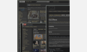
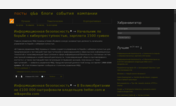
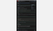
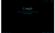

Black background, light text:PitchDark companion-I
Description:
More info
Reasons to install this style --
1. Saves your eyes from fatigue
2. Most videos and images look much better with a dark background. Same applies for flash based documents too.
3. Works uniformly across the web. No need to separately configure different sites. Wikipedia, Google, Orkut, Facebook, Youtube, Yahoo, Hotmail, Blogspot blogs, Wordpress blogs as well all other blogs, news sites, TED, Scribd, Calameo, Google books, Google maps, Wikimapia, Amazon, eBay, Slideshare, Wikitravel, Google Reader, Google Docs, Scientific American, New Scientist, AMO, Scienceblogs, funtrivia, Reuters are only some of the popular sites which appears much more beautiful with this style.
4. Reduces the power consumption of your screen and thereby increasing the life of your Laptops as well as being environment friendly
5. This style is frequently updated to work better with the ever changing web
___________________________
New features :
2011-10-21 : Adding dedicated support for facebook. May require frequent updates for a few days.
2010-04-23 : Suspending support for Google Wave till its code stabilizes
2010-04-05 : New minimalist theme for Google Wave.
2010-03-14 : Added a declutterer to Twitter
2009-05-06 : Added a minimalist dark and very readable glareless color scheme specially for Google Reader.
___________________________
Credits to users :
1. Thanks Simon for pointing out that this style works well with "In The Dark" ( ) theme too.
2. Thanks Tom Zai for suggesting the lightbox fix.
3. Thanks Yoon for pointing out the visited-links-color anomaly in Google Reader.
___________________________
Some recommendations for better results :
1. Use this style in conjunction with http://freestyler.ws/style/124310/black-background-pitchdark-companion-ii , http://freestyler.ws/style/100972/glowing-black-button-barbiegirl-design-edit and http://freestyler.ws/style/23033/unglaring-of-images-supplement-style
2. Keep your brightness and contrast settings low to avoid glare.
3. Install Royal Noir dark theme for XP
4. Choose a sans-serif font family
5. Use full-screen mode for better utilization of screen space. Press F11. To manage the behaviour of full-screen mode install AutoHide http://www.krickelkrackel.de/autohide/ addon.
6. Use AdblockPlus and AdblockPlus-element-hiding-helper addons to block some jarring background images. The (daily synced) filter list I use is at http://dl.dropbox.com/u/3317808/adblock.txt
7. You may also want to try http://freestyler.ws/style/132/check-marking-visited-links-with-custom-color by marcanth@userstyles ... it aids in separating visited links from unvisited links and keeps off the pressure to differentiate them by color.
___________________________
Caveats : As this is a global style meant to work with all websites so sometimes you may find some sites behaving oddly. Some elements may be obscured. Try switching off this style to find out if there is any problem caused by it. I would greatly appreciate if you drop me a line about it. If you have a solution, I would be happy to incorporate it (and of course credit it to you). If you have NoScript and AdBlock running try to see if they are causing problems.
____________________________
Credits & Updates : I originally derived this style from http://freestyler.ws/style/477/light-text-on-black-background . The main problem I had with the original style was that it blocked background images eg the wikipedia globe shown below. Since then this style has deviated a lot from its inspiration as well as growing in size and complexity greatly. Please see the changelog below (only last few changes) --
2011-11-21 -- some vexing facebook tweaks for transparencies and their homemade tooltips (which suck terribly)
2011-11-02 -- numerous tweaks to facebook and twitter along with many long pending changes
2011-10-26 -- facebook tweaking with tags, dialogs, forms
2011-10-21 -- Adding dedicated support for facebook. May require frequent updates for a few days.
2011-08-23 -- fixing some funky annoyances in AMO
2011-08-08 -- Long pending and numerous changes/tweaks
___________________________
Please take the trouble of mailing me if you spot any inconsistency or problem. Write to me at np1 AT nirajp DOT 8k DOT . Please leave a rating if you like this style.
PS : To view more screenshots as well as full list of changes, please visit https://sites.google.com/site/niraxar/software/pitch-dark-companion/pdarkcomp
First install FreeStyler to use this style.
If you already installed it, please, make sure this site is allowed to run JavaScript.But you can download Freestyler for other browsers and apply styles there!
Applies to:
http://, ftp://, file://, https://... More »