Related styles:
-
Azlyrics Wide Dark Mode
Installs:Created: Mar 15, 2013Last Updated: Nov 02, 2015 -
Created: Nov 02, 2015Last Updated: Dec 02, 2015
-
Created: Mar 07, 2013Last Updated: Sep 25, 2015
-
Created: Nov 02, 2015Last Updated: Nov 02, 2015
-
Created: Jun 28, 2015Last Updated: Aug 23, 2015
-
Created: Jun 23, 2014Last Updated: Oct 03, 2016
-
Created: Jan 11, 2017Last Updated: Jan 11, 2017
-
Created: Dec 25, 2014Last Updated: Apr 25, 2017
-
Created: Dec 24, 2015Last Updated: Oct 26, 2016



Steam Broadcasting Video Showcase
Description:
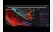
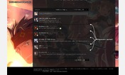
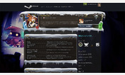
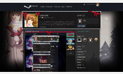
First, most of the global Steam header elements have been hidden. The useful stuff I kept on the top of the chat area.
Second, all the empty spaces on the sides of the broadcast video and chat are removed.
I also made use of an element to recolor chat. I liked the vignette the original image had so I keep it but color it (with low transparency.) If you would prefer a solid color, choose full transparency, ie 1.
Thank you for installing and please send me feedback, suggestions and requests for things you want in Steam Broadcasting UI down in the Discussions section below and remember to review.
More info
First install FreeStyler to use this style.
If you already installed it, please, make sure this site is allowed to run JavaScript.But you can download Freestyler for other browsers and apply styles there!
Applies to:
http://steamcommunity.com/broadcast/watch/