Related styles:
-
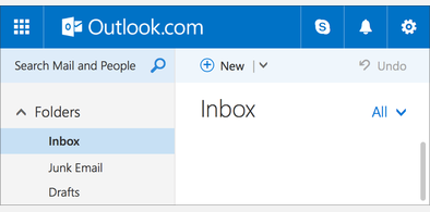
Sleek style for Outlook.com
Installs:Created: Jan 26, 2015Last Updated: Apr 15, 2017 -
Created: Aug 16, 2016Last Updated: Mar 01, 2017
-
Created: Jul 19, 2016Last Updated: Sep 20, 2016
-
Created: May 13, 2016Last Updated: May 13, 2016
-
Created: Jun 17, 2014Last Updated: Aug 09, 2014
-
Created: Jul 20, 2011Last Updated: Jul 20, 2011
-
Created: Jul 20, 2016Last Updated: Aug 07, 2016
-
Created: May 12, 2016Last Updated: May 12, 2016
-
Created: May 23, 2009Last Updated: May 24, 2009


falconer@userstyles deleted this style because of "This modification was a random, one-off idea; I haven't properly updated it for the latest Ars Technica layout changes."
Try Ars Technica - 2016 Dark Theme Font & Colors fix instead of this deleted style.
See more styles for Arstechnica
old: falconer's Ars Technica 5.0 tweaks
Description:
Dramatically reduces the size of:
- The featured stories block on the home page (from 1000x335 to 1000x150)
- Primary images inside individual articles (from 640x360 to 250x140)
Other minor tweaks:
- Changes the name of the "All" link to a more accurate name, "Home"
- Adds subtle borders around the main navigation bars and the related story boxes
Text sizes (for Firefox, Ars, etc.) must be set to their normal/default setting.
Of course, if Ars changes anything, this code will break, but it works as of 1/29/09.
First install FreeStyler to use this style.
If you already installed it, please, make sure this site is allowed to run JavaScript.But you can download Freestyler for other browsers and apply styles there!
Applies to:
arstechnica.com