Related styles:
-
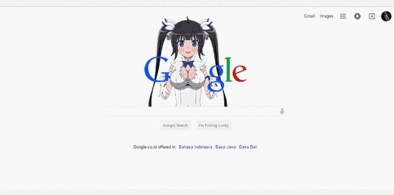
Google Hestia (Anime) version
Installs:Created: Apr 18, 2015Last Updated: Apr 22, 2015 -
Created: Jan 25, 2016Last Updated: Feb 22, 2017
-
Created: Dec 06, 2012Last Updated: Sep 08, 2015
-
Created: Sep 03, 2016Last Updated: Feb 21, 2017
-
Created: Jan 29, 2015Last Updated: Feb 24, 2016
-
Created: Jul 25, 2014Last Updated: Mar 08, 2017
-
Created: Feb 18, 2014Last Updated: Jan 28, 2016
-
Created: Feb 22, 2012Last Updated: Feb 09, 2015
-
Created: Feb 02, 2015Last Updated: Feb 24, 2016


MoogleMaster@userstyles deleted this style
Try Google Hestia (Anime) version instead of this deleted style.
See more styles for Google
OSX Style for New Google Reader Slightly Improved
Description:
Made the bar below the entries the same height as the bar below the tree on the left
Added hover and selected backgrounds for the tree
Eliminated the small amount of space between the top bar that shows the title of the feed and the bar that collapses the tree
Made the title of a feed in the top bar white when looking at the feed directly (not in a folder)
Made any feeds not grouped into a folder show the orange RSS logo rather than the folder logo
There might be a few others. I'll probably be making more slight modifications to this over time. Only tested in FF3 so might not be as good in FF2.
See also OSX Spinner for New Google Reader for a nice spinner for the new Google Reader.
First install FreeStyler to use this style.
If you already installed it, please, make sure this site is allowed to run JavaScript.But you can download Freestyler for other browsers and apply styles there!
Applies to:
http://www.google.com/reader/view/, https://www.google.com/reader/view/