Related styles:
-
Created: Apr 17, 2009Last Updated: Jul 26, 2009
-
Created: Jul 25, 2009Last Updated: Jul 26, 2009
-
Created: Apr 12, 2009Last Updated: Apr 13, 2009
-
Created: Sep 18, 2009Last Updated: Sep 19, 2009
-
Created: Jul 17, 2010Last Updated: Oct 27, 2010
-
Created: Apr 17, 2009Last Updated: Apr 17, 2009
-
Created: Jul 18, 2009Last Updated: Jul 19, 2009
-
Created: Jan 17, 2009Last Updated: Jan 18, 2009
-
Created: Aug 08, 2014Last Updated: Aug 08, 2014


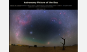
APOD; Astronomy Picture of the Day, dark, margins
Description:
I had written one to give it margins that I had been using, incorporated their idea to give it a black background and remove the boarder around the images. I also made the text easier to read being a shade of white instead of grey. I used an .em font size instead of a .px size they had used which will size the text to your default. Made the links a little brighter than the text and underlined, change when they are selected, active, or visited. Made bold text slightly bigger and brighter than regular text. Set the default color of text to snow color that wasn't inside some other in-line element such as P or B which the other two neglected (this left some text still black and invisible) by setting the the text color style for body of the page.
First install FreeStyler to use this style.
If you already installed it, please, make sure this site is allowed to run JavaScript.But you can download Freestyler for other browsers and apply styles there!
Applies to:
apod.nasa.gov