Related styles:
-
Japan probe without wasted space
Installs:Created: Nov 09, 2011Last Updated: Nov 09, 2011 -
Created: Nov 09, 2011Last Updated: May 23, 2012
-
Created: Nov 09, 2011Last Updated: Nov 09, 2011
-
Created: Sep 04, 2015Last Updated: Sep 04, 2015
-
Created: Aug 27, 2016Last Updated: Feb 23, 2017
-
Created: Dec 09, 2011Last Updated: Dec 10, 2011
-
Created: May 31, 2012Last Updated: Jun 01, 2012
-
Created: Feb 11, 2014Last Updated: Feb 12, 2014
-
Created: May 21, 2011Last Updated: Jun 08, 2011


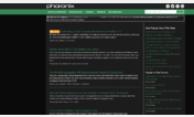
Phoronix without wasted space (ideal for netbooks)
Description:
Now the text extends the whole width of the screen so no more wasted space
First install FreeStyler to use this style.
If you already installed it, please, make sure this site is allowed to run JavaScript.But you can download Freestyler for other browsers and apply styles there!
Applies to:
www.phoronix.com