Related styles:
-
Google Maps and Mail Vista
Installs:Created: Jan 27, 2007Last Updated: Feb 03, 2007 -
Created: Jan 27, 2007Last Updated: Jan 28, 2007
-
Created: Apr 18, 2015Last Updated: Apr 22, 2015
-
Created: Jan 25, 2016Last Updated: Feb 22, 2017
-
Created: Dec 06, 2012Last Updated: Sep 08, 2015
-
Created: Sep 03, 2016Last Updated: Feb 21, 2017
-
Created: Jan 29, 2015Last Updated: Feb 24, 2016
-
Created: Jul 25, 2014Last Updated: Mar 08, 2017
-
Created: Feb 18, 2014Last Updated: Jan 28, 2016





Nick Roberts@userstyles deleted this style
Try Google Maps and Mail Vista instead of this deleted style.
See more styles for Google
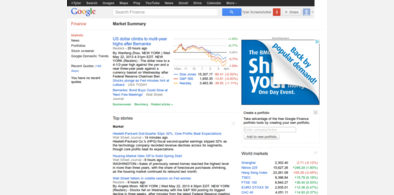
Google Reader - Clean and Professional
Description:
(Version 3.23)
July 17, 2007
I know this isn't for everyone. It's for the ultimate
"clean page" person who like things uncluttered and clean.
----------------------------------------------------------------------------------
Credits:
* Original code copied from "Google Reader Streamlined" by Chris Pederick
* Added code copied from OSX Style Google Reader
-----------------------------------------------------------------------------------
Change log:
3.23
* Added a few pixels of space before the top of the page.
3.22
* Changed link font color to be a little more bold.
3.21
* Added "Starred Items' Back into menu
3.2
* Cleaned up more code
* Removed lines and bars
3.11
* Fixed critical bug
3.1
* Numerous bug fixes from 3.0 version
* Cleaned up code
3.0
* Complete redesign.
* Revamped main font to be more readable and standard
* Softened colors
2.2
* Added a fixed width of 95% to main cont
First install FreeStyler to use this style.
If you already installed it, please, make sure this site is allowed to run JavaScript.But you can download Freestyler for other browsers and apply styles there!
Applies to:
http://www.google.com/reader, https://www.google.com/reader