
Related styles:
-
Medium glare
Installs:Created: May 21, 2014Last Updated: Jun 02, 2014 -
 Created: Dec 11, 2013Last Updated: Dec 11, 2013
 -
 Created: Dec 20, 2013Last Updated: Dec 20, 2013
 -
 Created: Jun 27, 2014Last Updated: Jun 27, 2014
 -
 Created: Apr 25, 2014Last Updated: Apr 25, 2014
 -
 Created: May 27, 2014Last Updated: May 27, 2014
 -
 Created: May 28, 2015Last Updated: May 28, 2015
 -
 Created: Mar 08, 2016Last Updated: Mar 09, 2016
 -
 Created: Jan 08, 2017Last Updated: Jan 08, 2017

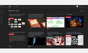
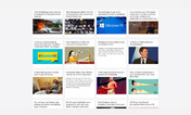
Readable Pocket
Description:
Pocket's light style is too bright for me. Inverse fuddles my eyes, and sepia is just a little embarrassing.
Also there is still too much cruft for me.
First install FreeStyler to use this style.
If you already installed it, please, make sure this site is allowed to run JavaScript.But you can download Freestyler for other browsers and apply styles there!
Applies to:
getpocket.com