Related styles:
-
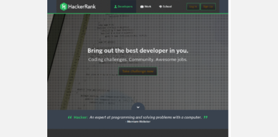
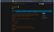
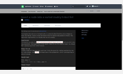
Dark HackerRank
Installs:Created: Apr 24, 2015Last Updated: Jan 06, 2017 -
Created: Feb 03, 2017Last Updated: Feb 06, 2017
-
Created: Feb 27, 2017Last Updated: Mar 02, 2017
-
Created: Aug 20, 2015Last Updated: Aug 20, 2015
-
Created: Feb 29, 2016Last Updated: Feb 29, 2016



Purple HackerRank
Description:
If anyone has some advice on colour schemes or CSS or whatever, feel free to say something :-\
Grey variant here: http://freestyler.ws/style/119124/dark-hackerrank
More info
15/5/2015 - Fixed up buttons too! Yay!
28/5/2015 - More fixups. It's a bit of a pain to figure some of these things out. Webby stuff just loves to bury hidden stuff under sneaky stuff obscured by weird things that don't make much sense :|
28/5/2015 - Found another little issue while working on the other style.
28/5/2015 - *whistles innocently*
29/5/2015 - More fixups
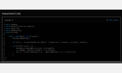
31/5/2015 - Code submission cancel button (though not the confirm button, likely thanks to my /amazing/ CSS skills) fixed, fixed a big white bar after code submission
2/12/2015 - Updated some front-page stuff and the login page (who sees those anyway, right?) as well as the new feed page.
First install FreeStyler to use this style.
If you already installed it, please, make sure this site is allowed to run JavaScript.But you can download Freestyler for other browsers and apply styles there!
Applies to:
hackerrank.com