Related styles:
-
Feedly Moon Phase
Installs:Created: Mar 28, 2013Last Updated: Apr 01, 2013 -
Created: Jan 09, 2017Last Updated: Jan 24, 2017
-
Created: Nov 15, 2012Last Updated: Nov 19, 2012
-
Created: Sep 20, 2016Last Updated: Sep 20, 2016
-
Created: Oct 07, 2012Last Updated: Oct 08, 2012
-
Created: May 12, 2014Last Updated: Sep 20, 2014
-
Created: Jan 24, 2017Last Updated: Jan 24, 2017
-
Created: May 02, 2013Last Updated: May 02, 2013
-
Created: Apr 05, 2014Last Updated: Apr 05, 2014

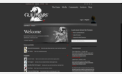
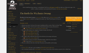

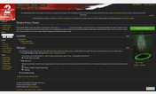
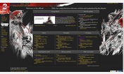

GW2 Wiki Content Driven remix
Description:
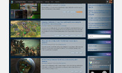
- Hiden non-content related stuff.
- Big maps!.
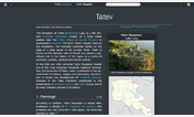
- Search field always visible.
- Table of Contents always accessible.
- Quick info box always on screen.
- No more old-blue links, Guild Wars 2 is all about red! (except for external links which decided to leave them blue).
If you find anything on the Wiki's design that can be improved or any bug when you use this style please leave a comment and we'll see what can be done.
More info
- Updated header to match HoT.
- Fixed quick info box, not displaying or hiding elements.
- Fixed quick info box always displaying scroll bars.
- Got rid of the collapsible feature because it caused more harm than good.
v0.2
- Fixed a problem with the menu (table of contents) that rendered it intrusive and really anoying on some cases.
- Collapsible tables are now collapsed by default. No more kilometric scrolls to reach your content. Mouse over to expand your choice.
v0.1
- 1st release.
To do:
- Beautify more stuffz.
- Dark theme (At some point in the -far- future).
First install FreeStyler to use this style.
If you already installed it, please, make sure this site is allowed to run JavaScript.But you can download Freestyler for other browsers and apply styles there!
Applies to:
wiki.guildwars2.com