Related styles:
-
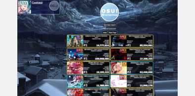
osu! Statistics ~ El vi Britannia Themed
Installs:Created: Oct 18, 2016Last Updated: Oct 18, 2016 -
Created: Oct 19, 2016Last Updated: Oct 23, 2016
-
Created: Jan 17, 2016Last Updated: Oct 31, 2016
-
Created: Apr 21, 2016Last Updated: Nov 30, 2016
-
Created: Jun 29, 2015Last Updated: Nov 21, 2015
-
Created: Feb 25, 2017Last Updated: Feb 25, 2017
-
Created: Mar 29, 2015Last Updated: Mar 29, 2015
-
Created: May 14, 2015Last Updated: Aug 17, 2015
-
Created: Mar 11, 2016Last Updated: May 31, 2016


osu! El vi Britannia Remake
Description:
All inspired by a screenshot that was posted on EvB's Twitter, that's how I got into coding with CSS. This is the first design that I have been working on.
I used http://freestyler.ws/style/110526/osu-dark-transparent by EmingK as a template for my CSS
More info
- osu!plus
- osu! PP Save
Thanks to:
https://osu.ppy.sh/u/4232733: For making the Osu! Logo(s)and providing some of the ranking images.
https://www.reddit.com/user/x_Darkon: Using his CSS as a backup because I firetrucked mine
https://www.livecoding.tv/flipybitz/: Fixing stuff that was too difficult for me
EmingK@userstyles: Source Code
Known Bugs/Oddities:
-Using the Dropdown menu animation will spazz out if your cursor movements are really fast. This can't be fixed without Java Script as far as I know
Fixed:
-When you are in the post form (Forum, Personal Message, Userpage), you will not be able to see the color selector that would be at the right side of the screen.
It appears that this small and compact code fixes it: http://pastebin.com/Tjgu30u4
-One of the tables in the wiki looks really ugly, but it seems like you can't work around it without it still looking bad. So I just left it unedited.
Fixing it was easier than I thought. Still doesn't look super appealing, but it's way better than before
-When using the Tampermonkey/Greasemonkey script "osu!plus" the top play will not be highlighted
Added a temporary dropdown option for it. Will remove it when I find a smart way to avoid it.
-I have been told giving Kudosu to somebody looks odd, but I can't fix it because I don't have any.
Thanks to https://osu.ppy.sh/u/6777358 I was able to see that giving somebody Kudos doesn't look weird to begin with.
-There is an ugly image on the E-Mail verification page. This will be fixed when I find the page again.
I am not exactly sure why but I had to verify my e-mail adress again so I managed to improve the look of the image.
First install FreeStyler to use this style.
If you already installed it, please, make sure this site is allowed to run JavaScript.But you can download Freestyler for other browsers and apply styles there!
Applies to:
osu.ppy.sh, https://osu.ppy.sh/b/, https://osu.ppy.sh/s/, disqus.com