Related styles:
-
LJ Skin: Visions v2 - a Dystopic Vertigo
Installs:Created: Jun 24, 2007Last Updated: Nov 03, 2010 -
Created: Nov 01, 2007Last Updated: Nov 02, 2007
-
Created: Jun 06, 2013Last Updated: Jun 07, 2013
-
Created: May 16, 2009Last Updated: May 17, 2009
-
Created: Sep 28, 2014Last Updated: Sep 30, 2014
-
Created: Dec 16, 2013Last Updated: Dec 17, 2013
-
Created: Jun 18, 2014Last Updated: Jun 18, 2014
-
Created: Jun 05, 2014Last Updated: Jun 04, 2014
-
Created: Jun 19, 2014Last Updated: Jun 19, 2014


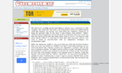
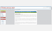
Make thedailywtf.com much more readable
Description:
First install FreeStyler to use this style.
If you already installed it, please, make sure this site is allowed to run JavaScript.But you can download Freestyler for other browsers and apply styles there!
Applies to:
thedailywtf.com