Related styles:
-
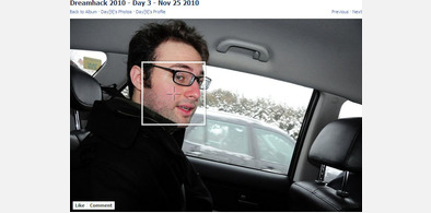
Facebook Photo Tag Crosshair
Installs:Created: Nov 15, 2008Last Updated: Oct 23, 2011 -
Created: Sep 13, 2011Last Updated: Sep 14, 2011
-
Created: May 30, 2010Last Updated: Sep 13, 2015
-
Created: Aug 05, 2012Last Updated: Aug 06, 2012
-
Created: May 24, 2009Last Updated: Jun 13, 2012
-
Created: Feb 17, 2012Last Updated: Feb 18, 2012
-
Created: May 01, 2011Last Updated: May 11, 2015
-
Created: Sep 01, 2014Last Updated: Jan 18, 2017
-
Created: Aug 09, 2013Last Updated: Aug 10, 2013






ALok@userstyles deleted this style
Try Facebook Photo Tag Crosshair instead of this deleted style.
See other styles
Facebook - Dark2
Description:
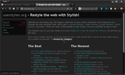
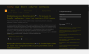
This is a modification of the existing dark facebook theme [ Facebook DARK ]: Cleaning up some of the glitches the other one created. There are still a few places where it could use work, but this has come farther along since the original version here.
Also added is a crosshair for the phototags, that tells more accurately (though not perfectly) where the user was clicking when the tagging was done.
-- 02 Mar 2007
And continuing to add more little fixes, and fixed more phototagging stuff, typeahead boxes, and stuff.
-- 19 Mar 2007
One more fix to a minor background glitch
--20 Mar 2007
Changed highlight color to stand out a little more
First install FreeStyler to use this style.
If you already installed it, please, make sure this site is allowed to run JavaScript.But you can download Freestyler for other browsers and apply styles there!
Applies to:
facebook.com