Related styles:
-
Cleaner FriendFeed V2
Installs:Created: Sep 17, 2008Last Updated: Sep 19, 2008 -
Created: Jun 27, 2011Last Updated: Jun 28, 2011
-
Created: Oct 21, 2009Last Updated: Oct 22, 2009
-
Created: May 28, 2009Last Updated: May 29, 2009
-
Created: Jun 29, 2009Last Updated: Jun 30, 2009
-
Created: Aug 13, 2009Last Updated: Aug 14, 2009
-
Created: Jun 29, 2009Last Updated: Jun 30, 2009
-
Created: Aug 24, 2008Last Updated: Aug 26, 2008
-
Created: Apr 05, 2009Last Updated: Apr 24, 2009

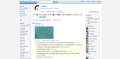
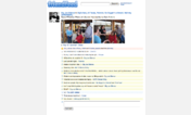
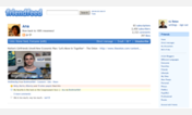
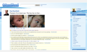
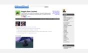
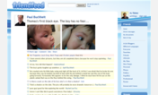
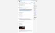
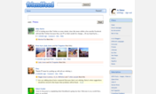

Cleaner FriendFeed (04/29/09)
Description:
-- removed the grey background
-- removed the bar background and made it subtle
-- some font size changes
-- some spacing adjustments
-- select text background changed
Update (04/24/2009):
-- search term highlighted with light teal green
Update (04/29/2009)
-- As suggested by Kristian Salonen (http://friendfeed.com/krisu), now using Data URI. The new FriendFeed logo isn't transparent.
* Cleaner and cool look and feel (FriendFeed is already clean, this makes it a lot cleaner)
* Different font style
* Highlights friends comments with baby yellow (instantly know that the user is already your friend)
* Highlights your comments with baby blue (it’s cool to see your own comments from river of comments. Looks good when you are a distance away your computer, makes your comment a marker in conversations)
* Highlights Likes to light pink
* Dims comments from non-friends (normal color of FriendFeed comment)
* Separated each posts with a bottom border
This use
First install FreeStyler to use this style.
If you already installed it, please, make sure this site is allowed to run JavaScript.But you can download Freestyler for other browsers and apply styles there!
Applies to:
friendfeed.com