Related styles:
-
TheDickShow - Dark Style
Installs:Created: Jun 08, 2016Last Updated: Jul 05, 2016 -
Created: Aug 28, 2014Last Updated: Nov 01, 2016
-
Created: May 28, 2014Last Updated: Nov 29, 2016
-
Created: Oct 30, 2016Last Updated: Dec 07, 2016
-
Created: Oct 14, 2016Last Updated: Oct 17, 2016
-
Created: Nov 04, 2012Last Updated: Sep 18, 2016
-
Created: Oct 30, 2016Last Updated: Oct 30, 2016
-
Created: Jun 12, 2016Last Updated: Oct 30, 2016
-
Created: Oct 28, 2016Last Updated: Oct 29, 2016

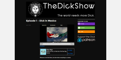


CheatFreak47@userstyles deleted this style because of "RIP biggest problem"
Try TheDickShow - Dark Style instead of this deleted style.
See more styles for Thedickshow
Biggest Problem Dark
Description:
Includes options for filtering the Facebook Comments section via inversion, which is a rather dirty method for doing it, since not all browsers support html5 filters yet, but i managed to make it as compatible as possible.
It now also includes an option to hide that horribly ugly Flash Player on the right, which I obviously can't do anything to style.
Both of the above options are enabled by default.
RIP Biggest Problem
More info
- fixed a big white box that appears when the navigation bar jumps to follow the UI
- added remove flash player option
- made inversion and remove flash player option the default
First install FreeStyler to use this style.
If you already installed it, please, make sure this site is allowed to run JavaScript.But you can download Freestyler for other browsers and apply styles there!
Applies to:
biggest.thedickshow.com