
Related styles:
-
 Created: Jul 21, 2008Last Updated: Jul 27, 2008
 -
 Created: Apr 29, 2008Last Updated: Apr 30, 2008
 -
 Created: Dec 27, 2006Last Updated: Dec 30, 2006
 -
 Created: Jul 21, 2006Last Updated: Jul 22, 2006
 -
 Created: Apr 23, 2007Last Updated: Apr 25, 2007
 -
 Created: Aug 29, 2006Last Updated: Aug 30, 2006
 -
 Created: Apr 20, 2006Last Updated: Apr 22, 2006
 -
 Created: Apr 28, 2006Last Updated: Feb 13, 2007
 -
 Created: May 30, 2010Last Updated: Sep 13, 2015

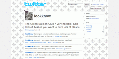
xexagon@userstyles deleted this style
Try Twitter - remove 'hey there', improve typography instead of this deleted style.
See other styles
Lifehacker - streamlined
Description:
Much the same as before - a more basic, readable version of the Lifehacker site. Uses lots of relative units, so it should make the site more accessible (for example, you don't have to scroll across the page on an 800X600 screen).
Blocks a lot of unnecessary images, so load times are also improved.
Doesn't play well with the screenshot tour posts; they are still navigable, but if you need this Lifehacker feature, you may not like this style.
If you would like a less severe style, try Better Lifehacker. It doesn't 'break' the site.
@Urban Legend - Thanks for the feedback. The number of comments and the last commenter does appear on the page, and some of us don't have such great eyesight!
The front page link popups do appear some distance below the actual links - I am working on a way round this, but it's quite complicated. TBH, I've never looked at a screenshot tour, but I see that some text overla
First install FreeStyler to use this style.
If you already installed it, please, make sure this site is allowed to run JavaScript.But you can download Freestyler for other browsers and apply styles there!
Applies to:
lifehacker.com