Related styles:
-
Gitlab Issue Boards - Hide Done
Installs:Created: Feb 08, 2017Last Updated: Feb 08, 2017 -
Created: Feb 08, 2017Last Updated: Feb 08, 2017
-
Created: Feb 08, 2016Last Updated: Mar 16, 2016
-
Created: Jul 31, 2015Last Updated: Jul 31, 2015
-
Created: Mar 22, 2015Last Updated: Mar 22, 2015
-
Created: Feb 22, 2016Last Updated: Feb 29, 2016
-
Created: Jul 23, 2015Last Updated: Jul 23, 2015
-
Created: Mar 20, 2015Last Updated: Mar 23, 2015
-
Created: May 19, 2016Last Updated: May 19, 2016



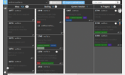

Gitlab On A Diet - Less Padding - Less Info - WIP
Description:
More info
As always, feel free to contribute at https://gitlab.com/unchris/userstyles
First install FreeStyler to use this style.
If you already installed it, please, make sure this site is allowed to run JavaScript.But you can download Freestyler for other browsers and apply styles there!
Applies to:
gitlab.com