
Related styles:
-
 Created: Jan 06, 2009Last Updated: Jan 07, 2009
 -
 Created: Jan 06, 2009Last Updated: Jun 05, 2009
 -
 Created: Jan 06, 2009Last Updated: Jan 07, 2009
 -
 Created: May 30, 2010Last Updated: Sep 13, 2015
 -
 Created: Aug 05, 2012Last Updated: Aug 06, 2012
 -
 Created: May 24, 2009Last Updated: Jun 13, 2012
 -
 Created: Feb 17, 2012Last Updated: Feb 18, 2012
 -
 Created: May 01, 2011Last Updated: May 11, 2015
 -
 Created: Sep 01, 2014Last Updated: Jan 18, 2017

znerp@userstyles deleted this style
Try experts-exchange hide rubbish, show solutions instead of this deleted style.
See other styles
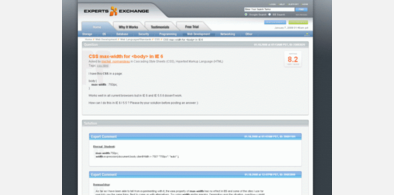
collegehumor.com wider, no ads
Description:
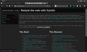
(I also recommend userstyles.org - don't resize screenshots for anyone else who wants to see the screenshots below fullsize.)
*UPDATE Feb 12th * Orange background on updates extended to the width of the centre column.
First install FreeStyler to use this style.
If you already installed it, please, make sure this site is allowed to run JavaScript.But you can download Freestyler for other browsers and apply styles there!
Applies to:
collegehumor.com