Related styles:
-
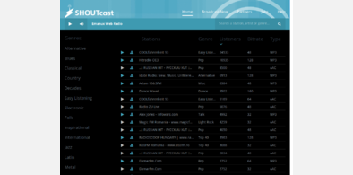
Shoutcast dark (by Jooch)
Installs:Created: Dec 20, 2015Last Updated: Dec 20, 2015 -
Created: Oct 25, 2009Last Updated: Oct 26, 2009
-
Created: Oct 28, 2009Last Updated: Oct 29, 2009
-
Created: Feb 21, 2015Last Updated: Feb 21, 2015
-
Created: Feb 21, 2015Last Updated: Feb 21, 2015
-
Created: Oct 18, 2015Last Updated: Oct 18, 2015
-
Created: Sep 23, 2009Last Updated: Sep 24, 2009
-
Created: Mar 21, 2006Last Updated: Mar 22, 2006


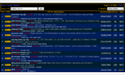
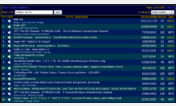
shoutcast.com - clean dark grey redesign
Description:
*
* Author : NeoVanGoth
* Date : February 16th, 2007
* Description : Complete redesign of shoutcast.com, losely based on Valacars Google Web Search - dark grey redesign.
Removed all unnecessary elements to get as much space as possible for the channellist.
Removed the "results per page" on the right side too, because it isn't working anyway.
This is my first css redesign, so many elements may be redundant.
* Todo : Alternative for that ugly "tune in"-image.
* Usage : Use with FreeStyler extension (https://freestyler.ws/) or copy to your Firefox userContent.css file
* Thanks to : Valacar for his great google redesign
First install FreeStyler to use this style.
If you already installed it, please, make sure this site is allowed to run JavaScript.But you can download Freestyler for other browsers and apply styles there!
Applies to:
shoutcast.com