ScrapTF Light chat theme

Added by et_eito@userstyles, Created: May 09, 2016, Updated: May 11, 2016

Description:

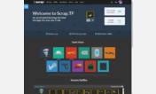
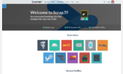
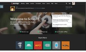
This style is meant to give the chat over at the Scrap TF website a make over to look brighter. The default themes the chat gives you are all very bland and dark, which might not suit some users' needs.

More info
  • V0.3 - Starting up
    • Added the color scheme to the start and join chat menu aswell.
    • Added the black name color to the dropdown menu aswell.
    • Played around with font sizes and weights so that everything is readable.


  • V0.2 - No tricks, no gimmicks!
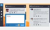
    • Removed gimmicky chat-message-on-the-right. This isn't Tweetdeck.
    • Changed every person's color to blackish. You can now properly read light-colored names on a light-colored background. Hooray! (If there are suggestions on how to keep name color in while keeping readability, please do enlighten me)
    • Updated top bar to now have white labels all around. No more searching in the deep blue.
    • Did some work for future implementations. Secret features?


  • V0.1 - Initial release. A lot of bugs, and many name colors will not pop out of the background.

Installs:
Applies to:
https://chat.scrap.tf/chat
License:
CC0 1.0 Universal.
et_eito@userstyles has waived all copyright and related or neighboring rights to ScrapTF Light chat theme, to the extent allowed by law.

Related styles:

WARNING: This webware is not functioning properly. Please enable javascript in your browser and try again.