Related styles:
-
Google Reloaded 2 .se edition
Installs:Created: Jun 01, 2009Last Updated: Jun 02, 2009 -
Created: Sep 15, 2009Last Updated: Sep 16, 2009
-
Created: Jun 01, 2009Last Updated: Jun 02, 2009
-
Created: Jun 01, 2009Last Updated: Jun 02, 2009
-
Created: Jun 01, 2009Last Updated: Jun 02, 2009
-
Created: Jun 01, 2009Last Updated: Jun 02, 2009
-
Created: Jun 01, 2009Last Updated: Jun 02, 2009
-
Created: Jun 01, 2009Last Updated: Jun 02, 2009
-
Created: Aug 16, 2010Last Updated: Aug 16, 2011


Google Reloaded 2 .com edition
Description:
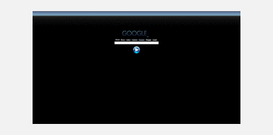
This edition implements the style for the Google front page and the web search-pages only. For now, at least…
OBS!:
The Google source differs in all it's editions, why this edition differs from others concerning the gbar.
You will notice the gbar is placed in the middle when you view the search results.
I might be able to fix this, but for now it will remain where it is.
Please observe: This is the US (.com) edition!
Other editions:
google.se edition: Google Reloaded 2 .se edition
google.co.uk edition: Google Reloaded 2 .co.uk edition
google.it edition: Google Reloaded 2 .it edition
google.fr edition: Google Reloaded 2 .fr edition
google.de edition: Google Reloaded 2 .de edition
google.es edition: Google Reloaded 2 .es edition
google.no edition: Google Reloaded 2 .no edition
First install FreeStyler to use this style.
If you already installed it, please, make sure this site is allowed to run JavaScript.But you can download Freestyler for other browsers and apply styles there!
Applies to:
http://www.google.com/intl/en/, http://www.google.com/webhp