Related styles:
-
Wikipedia for Typophiles (On a Budget)
Installs:Created: Sep 07, 2009Last Updated: Sep 08, 2009 -
Created: Aug 25, 2011Last Updated: Aug 26, 2011
-
Created: Apr 25, 2011Last Updated: Apr 26, 2011
-
Created: Dec 19, 2015Last Updated: Jan 15, 2017
-
Created: Mar 20, 2014Last Updated: Apr 10, 2014
-
Created: Mar 23, 2014Last Updated: Nov 14, 2016
-
Created: Sep 17, 2013Last Updated: Mar 22, 2015
-
Created: Apr 12, 2012Last Updated: Sep 27, 2014
-
Created: Apr 14, 2015Last Updated: Apr 14, 2015

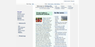
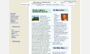
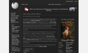


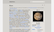

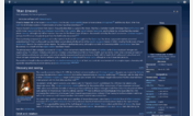
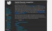

Wikipedia For Typophiles PLUS
Description:
UPDATE: June 6, 2009 -- Added support for German, French and Italian Wikipedia and Wiktionary; per Celuie's suggestion, I also added other possible variations in the font stacks (e.g., not just "Whitney Medium" but "WhitneyHTF-Medium"). The homepages are still a bit off -- any suggestions on fixing this?
BETTER SCREENSHOT HERE: http://i239.photobucket.com/albums/ff95/herarchitectlover/Tubercle2.png
The basic look of this style: Wikipedia for Typophiles ...
PLUS
A List Apart's color scheme and link styles (http://www.alistapart.com) ...
PLUS
Stylish bullets in the thumbnail captions and disambiguation links using Hoefler & Frere-Jones' MercuryNumericG4-SemiItalic typeface.
REQUIRED: Gotham Rounded Medium, Gotham Rounded Bold, Whitney, Whitney Condensed and MercuryNumericG4-SemiItalic.
I realize this isn't for everybody, but if yo
First install FreeStyler to use this style.
If you already installed it, please, make sure this site is allowed to run JavaScript.But you can download Freestyler for other browsers and apply styles there!
Applies to:
http://www.wikipedia, http://en.wikipedia, http://de.wikipedia, http://fr.wikipedia... More »