Related styles:
-
VSTS - Dark
Installs:Created: Oct 24, 2016Last Updated: Apr 24, 2017 -
Created: Dec 02, 2016Last Updated: Dec 02, 2016
-
Created: Sep 21, 2016Last Updated: Sep 21, 2016
-
Created: Jan 25, 2017Last Updated: Jan 25, 2017
-
Created: Nov 23, 2016Last Updated: Nov 28, 2016
-
Created: Apr 18, 2015Last Updated: Apr 22, 2015
-
Created: Jan 25, 2016Last Updated: Feb 22, 2017
-
Created: Dec 06, 2012Last Updated: Sep 08, 2015
-
Created: Sep 03, 2016Last Updated: Feb 21, 2017



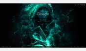
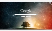
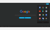

Google Calendar - Dark Theme
Description:
The source SASS for this theme is available (with my other stylish themes) https://github.com/zposten/stylish.
More info
What this means for you as the user is that if you see this happen, you can either wait a few days for me to fix it (assuming that everyone gets the same change at the same time, and with a company as big as Google who knows), or if yours is different than mine for some reason, you can make a pull request in my repo https://github.com/zposten/stylish, or you can send me a message with the class name that you need added to the list.
The list is currently the following. Note the odd, seemingly random pattern of letters.
#gb .gb_ve,
#gb .gb_re,
#gb .gb_se,
#gb .gb_ue,
#gb .gb_wf,
#gb .gb_we,
#gb .gb_ye,
#gb .gb_Ce,
#gb .gb_Cf,
#gb .gb_T,
#gb .gb_Bf,
#gb .gb_R,
#gb .gb_ib,
#gb .gb_gd
First install FreeStyler to use this style.
If you already installed it, please, make sure this site is allowed to run JavaScript.But you can download Freestyler for other browsers and apply styles there!
Applies to:
calendar.google.com