Related styles:
-
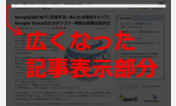
Compact TechCrunch (with comments)
Installs:Created: Jul 01, 2009Last Updated: Jul 02, 2009 -
Created: Nov 26, 2011Last Updated: Nov 27, 2011
-
Created: Apr 10, 2013Last Updated: May 05, 2016
-
Created: Apr 11, 2018Last Updated: Apr 11, 2018
-
Created: Sep 26, 2009Last Updated: Oct 11, 2009
-
Created: Oct 23, 2010Last Updated: Oct 24, 2010
-
Created: Apr 01, 2008Last Updated: May 04, 2008
-
Created: Sep 15, 2015Last Updated: Sep 14, 2015
-
Created: Jul 05, 2011Last Updated: Jul 12, 2011


Compact TechCrunch (without comments)
Description:
If you prefer comments intact, here's the version with them:
Compact TechCrunch (with comments)
First install FreeStyler to use this style.
If you already installed it, please, make sure this site is allowed to run JavaScript.But you can download Freestyler for other browsers and apply styles there!
Applies to:
techcrunch.com, crunchgear.com, mobilecrunch.com, techcrunchit.com... More »