Related styles:
-
Feedly - Dark n Flat
Installs:Created: Dec 26, 2016Last Updated: Feb 27, 2017 -
Created: Dec 21, 2016Last Updated: Dec 30, 2016
-
Created: May 04, 2013Last Updated: May 05, 2013
-
Created: Mar 30, 2017Last Updated: Apr 18, 2017
-
Created: Sep 12, 2015Last Updated: Jul 23, 2016
-
Created: Apr 15, 2016Last Updated: Apr 19, 2017
-
Created: Dec 23, 2019Last Updated: Aug 09, 2021
-
Created: Oct 29, 2013Last Updated: Oct 30, 2013
-
Created: Oct 27, 2013Last Updated: Dec 02, 2013







NexusMods - Dark n Flat
Description:
More info
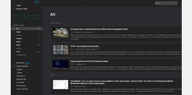
*Removes background images from controls and pages
*Increase how much screen real estate the site uses
*Tries to implement a flat and dark style with inspirations taken from Googles material design scheme
*There are lots of pages I haven't looked at yet and I have a lot of work still to put into this, if you notice any bugs and want them fixed ASAP give me a shoutout at jon245@msn(dot)com
*Turns many links into buttons, and makes current buttons larger and easier to click
Version:
0.10 alpha - some minor tweaks
0.9 alpha - more fixes, file lists under a mod should be easier to read
0.8 alpha - more fixes, more media query work on file view
0.7 alpha - More responsive to different screen size, normalized font weight, more vibrant blue, uses more screen real estate, and slightly darker
0.6 alpha
First install FreeStyler to use this style.
If you already installed it, please, make sure this site is allowed to run JavaScript.But you can download Freestyler for other browsers and apply styles there!
Applies to:
http://nexusmods.com, http://www.nexusmods.com, https://nexusmods.com, https://www.nexusmods.com