Related styles:
-
Created: Apr 17, 2009Last Updated: Jul 26, 2009
-
Created: Jul 25, 2009Last Updated: Jul 26, 2009
-
Created: Apr 12, 2009Last Updated: Apr 13, 2009
-
Created: Sep 18, 2009Last Updated: Sep 19, 2009
-
Created: Apr 17, 2009Last Updated: Apr 17, 2009
-
Created: Feb 09, 2009Last Updated: Jan 27, 2011
-
Created: Jul 17, 2010Last Updated: Oct 27, 2010
-
Created: Jan 17, 2009Last Updated: Jan 18, 2009


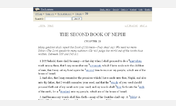
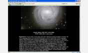
NACA, margins, highlight links
Description:
First install FreeStyler to use this style.
If you already installed it, please, make sure this site is allowed to run JavaScript.But you can download Freestyler for other browsers and apply styles there!
Applies to:
naca.com