Related styles:
-
Created: May 23, 2007Last Updated: Jun 06, 2008
-
Created: Feb 09, 2015Last Updated: Apr 13, 2015
-
Created: Sep 03, 2008Last Updated: Sep 04, 2008
-
Created: May 07, 2008Last Updated: Feb 07, 2009
-
Created: May 16, 2009Last Updated: May 17, 2009
-
Created: Apr 23, 2008Last Updated: Jan 01, 2010
-
Created: Dec 17, 2006Last Updated: Dec 24, 2006
-
Created: Dec 19, 2006Last Updated: Jan 22, 2009
-
Created: Oct 12, 2007Last Updated: Aug 14, 2008





b0at@userstyles deleted this style
Try Ars Technica - 2016 Dark Theme Font & Colors fix instead of this deleted style.
See more styles for Arstechnica
Ars Technica Forums: minimal
Description:
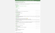
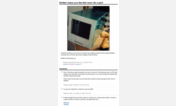
- appear-on-hover user and post details
- less vertical and horizontal space used for things like blockquotes and user names
- minimal header and footer: just page links and forum titles
- usable without scripting turned on
(You might also consider a user script to make individual posts easily linkable from the post icon with scripting turned off: http://userscripts.org/scripts/show/12616)
20090530: fix syntax error
20090528: green links
20090524: change link colors from the blinding orange to blue and gray
20090522: remove that new, huge header
20090129: cosmetic change - hide underlines on username links (compatibility workaround for http://freestyler.ws/style/1384/ars-technica-just-the-article-v5-from-jan-09 applying to the whole domain)
20080906: tweak for more consistency between post listings and post page
20080904: user name now in a small green tag at the top of each post, user and post details don't cause reflow (positioned within post), font sizes follows browser defaults, stop removing brs
First install FreeStyler to use this style.
If you already installed it, please, make sure this site is allowed to run JavaScript.But you can download Freestyler for other browsers and apply styles there!
Applies to:
episteme.arstechnica.com