Related styles:
-
Mastodon Variable Width
Installs:Created: Mar 04, 2017Last Updated: Apr 26, 2017 -
Created: Apr 01, 2017Last Updated: Apr 26, 2017
-
Created: Nov 22, 2016Last Updated: Nov 22, 2016
-
Created: Nov 26, 2016Last Updated: Dec 08, 2016
-
Created: Apr 01, 2017Last Updated: Apr 21, 2017
-
Created: Apr 17, 2017Last Updated: Apr 17, 2017
-
Created: Dec 09, 2016Last Updated: Apr 04, 2017
-
Created: Nov 04, 2016Last Updated: Nov 04, 2016
-
Created: Apr 12, 2017Last Updated: Apr 13, 2017

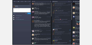
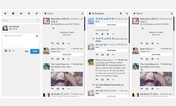

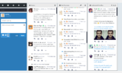
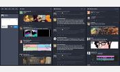
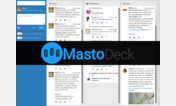
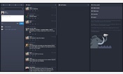
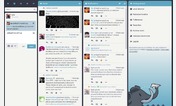

Mastodon: Flat, Dark and Colourful!
Description:
This style is quite short and simple so it shouldn’t be too hard to customise the colours if you want to.
Special thanks to @wremy@aleph.land for their help figuring out how to change some stuff!
Don’t forget to edit the target domains if the new theme doesn’t show up on your instance!
Now includes bottityttö’s Variable Width theme as an option
Feel free to use this theme by default on your instance, as is the case on im-in.space!
More info
- hopefully fixed the toot background sometimes not being the right colour on the latest Mastodon version
1.12:
- added a new wide option that I copypasted from bottityttö’s theme due to popular request. I hope it’s ok, it was CC-0 but idk
1.11:
- changed the privacy dropdown to the appropriate colour
- added an optional animation to the toot button when hovered or clicked
1.10:
- changed the colour of the buttons below the toot compose box
1.9:
- added a new colour option: blue and orange, for a slightly more vanilla look
1.8:
- fixed the headers not displaying (and added a pretty neat opacity gradient so it blends with the rest of the profile)
1.7:
- added a new colour option: yellow and purple
1.6:
- changed the magnifier icon to green so you can see it when hovering the search bar, and you can see the “erase all” button when typing
1.5:
- reverted the reply and favourite buttons to the original colour
1.4:
- made the reply indicator look less aggressive
1.3:
- made the name autocompleter thingy look more like the rest of the theme
- fixed the user profile view looking like garbage
1.2:
- added more instances to the default supported ones (you can still edit the css to add yours if it’s not in there)
1.1:
- changed the “show more button” to look less aggressive
1.0:
- release
First install FreeStyler to use this style.
If you already installed it, please, make sure this site is allowed to run JavaScript.But you can download Freestyler for other browsers and apply styles there!
Applies to:
https://mastodon.social/web, https://mastodon.xyz/web, https://social.tchncs.de/web, https://awoo.space/web... More »