Related styles:
-
Adobe by BamaBraves
Installs:Created: Apr 22, 2015Last Updated: Apr 22, 2015 -
Created: Feb 11, 2012Last Updated: Feb 12, 2012
-
Created: Apr 16, 2009Last Updated: Apr 17, 2009
-
Created: Mar 19, 2009Last Updated: Apr 06, 2009
-
Created: Apr 15, 2009Last Updated: Apr 15, 2009
-
Created: Nov 29, 2014Last Updated: Nov 29, 2014
-
Created: Apr 08, 2009Last Updated: Apr 09, 2009
-
Created: Aug 10, 2009Last Updated: Aug 12, 2009
-
Created: Apr 13, 2009Last Updated: May 25, 2012

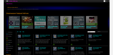




Adobes DevNet Reversed
Description:
First install FreeStyler to use this style.
If you already installed it, please, make sure this site is allowed to run JavaScript.But you can download Freestyler for other browsers and apply styles there!
Applies to:
www.adobe.com