Related styles:
-
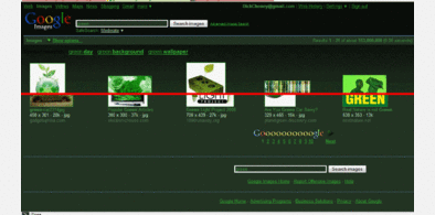
Dark Green Google (BillyNair)
Installs:Created: Oct 07, 2009Last Updated: May 11, 2010 -
Created: Apr 20, 2010Last Updated: Mar 12, 2012
-
Created: Jun 19, 2014Last Updated: Jan 26, 2015
-
Created: Sep 11, 2013Last Updated: Nov 23, 2017
-
Created: Jul 19, 2015Last Updated: Mar 20, 2016
-
Created: Apr 14, 2016Last Updated: Apr 21, 2016
-
Created: Sep 23, 2016Last Updated: Sep 23, 2016
-
Created: May 18, 2015Last Updated: May 19, 2015
-
Created: Nov 09, 2014Last Updated: Oct 11, 2015

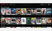
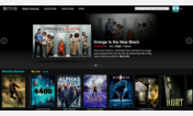
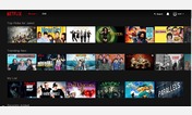
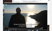


Netflix - Easy on the Eyes(BillyNair)
Description:
v2.3 - Adjusted for NF's new tabs
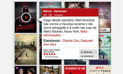
v2.2 - Found/fixed CSS code for popups!! (now you can read the titles!)
v2.1 - Minor cosmetic tweaks
v2.0 - Updated for Netflix new layout introduced March 2010
v1.0 - Ready for Official Release (fixed friend's pages)
b0.6 - Some readability tweaks
b0.5 - Made the red gradient longer, less strain vs the blue; fixed the "At Home" button
b0.4 - Minor cleanup of some areas
b0.3 - Found some text that was unreadable
b0.2 - Combined my home and work CSSs
b0.1 - Uploaded what I had to use at work
First install FreeStyler to use this style.
If you already installed it, please, make sure this site is allowed to run JavaScript.But you can download Freestyler for other browsers and apply styles there!
Applies to:
netflix.com