Related styles:
-
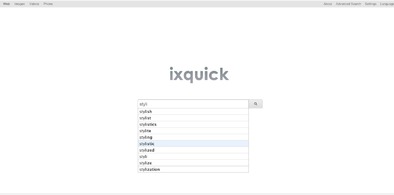
ixquick clean & minimal
Installs:Created: Apr 06, 2013Last Updated: Jan 03, 2014 -
Created: Jul 24, 2016Last Updated: Jul 24, 2016
-
Created: May 21, 2013Last Updated: May 22, 2013
-
Created: Jul 11, 2015Last Updated: Jul 11, 2015
-
Created: Jul 29, 2010Last Updated: Aug 24, 2010
-
Created: Sep 09, 2009Last Updated: Sep 11, 2009


makondo@userstyles deleted this style
Try ixquick dark & simple instead of this deleted style.
See more styles for Ixquick
Ixquick search - dark & clean
Description:
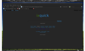
Fx only. Works, see the pic.
I also have styles that change favicon (one is shown on the shot below)- http://freestyler.ws/style/123422/ixquick-favicon & http://freestyler.ws/style/125027/ixquick-favicon-silver
http://freestyler.ws/style/63773/ixquick-for-the-night-owls
http://freestyler.ws/style/64090/ixquick-for-the-night-owls-2
startpage.com - by the same company - http://freestyler.ws/style/54951/startpage-com-darker-clean
A little better shot is here - http://img138.imageshack.us/img138/5209/full.png
More info
05/12 - made the results box scrollable, just too lazy to scroll the whole page down to pagination. It fits my screen fine but you can change it to suit yours, look for #results and change 640px to whatever looks good to you. Added visited links color.
First install FreeStyler to use this style.
If you already installed it, please, make sure this site is allowed to run JavaScript.But you can download Freestyler for other browsers and apply styles there!
Applies to:
ixquick.com, http://us2.ixquick.com, http://eu.ixquick.com/, http://eu.ixquick.com/do/preferences... More »