Related styles:
-
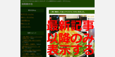
湘南番外地 - Remove fixed top entries
Installs:Created: Sep 30, 2009Last Updated: Mar 05, 2011 -
Created: May 05, 2010Last Updated: May 06, 2010
-
Created: Apr 24, 2009Last Updated: Oct 22, 2016
-
Created: May 15, 2013Last Updated: May 16, 2013
-
Created: Jun 27, 2010Last Updated: Sep 23, 2013
-
Created: May 10, 2009Last Updated: Mar 26, 2010
-
Created: May 20, 2009Last Updated: Jun 25, 2014
-
Created: Jan 24, 2010Last Updated: Oct 22, 2016
-
Created: Aug 11, 2010Last Updated: Aug 16, 2010


gizmodo + lifehacker - Remove Header
Description:
- gizmodo.jp
- gizmodo.com
- lifehacker.jp
- lifehacker.com
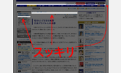
Gizmodo and Lifehacker use too thick header to reach its main article.
This style eliminates useless header to reduce redundant scrolling.
日本語版・英語版ギズモード/ライフハッカーのヘッダーを消し、記事を少しでも広く表示
-> スクロール時のストレスフリー
Use with the following Adblock Plus Subscription.
Adblock Plus の以下のフィルタとの併用が必要です
https://code.google.com/p/adblock-plus-japanese-filter/
More info
2011-05-29: Fixed layout collapse
2011-05-28: Added support for gizmodo.com + gizmodo.jp ; Changed Title for gizmodo
2010-12-01: Added support for lifehacker.com.
First install FreeStyler to use this style.
If you already installed it, please, make sure this site is allowed to run JavaScript.But you can download Freestyler for other browsers and apply styles there!
Applies to:
gizmodo.jp, lifehacker.jp, gizmodo.com, lifehacker.com