Related styles:
-
CodingHorror Comment Fix
Installs:Created: Mar 21, 2009Last Updated: Mar 22, 2009 -
Created: Jul 11, 2013Last Updated: Jul 31, 2013
-
Created: Sep 06, 2007Last Updated: Jan 26, 2010
-
Created: Jan 20, 2016Last Updated: Mar 03, 2016
-
Created: Oct 26, 2014Last Updated: Mar 03, 2015
-
Created: Jan 27, 2017Last Updated: Jan 27, 2017
-
Created: Oct 19, 2011Last Updated: Oct 24, 2011
-
Created: Jun 30, 2013Last Updated: Jul 01, 2013
-
Created: Jul 23, 2013Last Updated: Jul 24, 2013


Digg: Comment Box Fix
Description:
This style does the following:
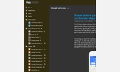
1 ) Fixes the position of the comment box to stick on the lower right corner of the screen
2 ) Adjusts the spacing of to center the content columns.
3) Removes the "check spelling" button. Why is that even necessary? Firefox already has a spell checker that's better than the pop-up box Digg offers.
First install FreeStyler to use this style.
If you already installed it, please, make sure this site is allowed to run JavaScript.But you can download Freestyler for other browsers and apply styles there!
Applies to:
digg.com