Related styles:
-
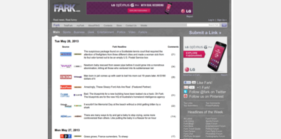
Fark Redesign - remove Front Page Hover
Installs:Created: Apr 24, 2007Last Updated: Apr 26, 2007 -
Created: Nov 18, 2008Last Updated: Nov 20, 2008
-
Created: Aug 31, 2010Last Updated: Jan 29, 2013
-
Created: Nov 18, 2008Last Updated: Nov 20, 2008
-
Created: Nov 18, 2008Last Updated: Nov 20, 2008
-
Created: Aug 17, 2010Last Updated: Jan 21, 2012
-
Created: Nov 18, 2008Last Updated: Nov 20, 2008
-
Created: Sep 05, 2010Last Updated: Sep 06, 2010
-
Created: Jan 18, 2012Last Updated: Nov 24, 2012


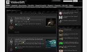


VideoSift Dark Theme
Description:
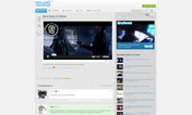
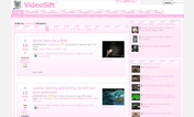
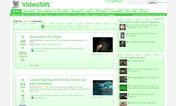
Most of the formating was done with pictures, which have been replaces with CSS borders and such, so the look is a bit different, but it renders fewer images, so it seems to render faster.
A few hard-to-convert pieces were removed, but they aren't that necessary anyway. One image (the vote buttons) is included in the CSS to convert that (the existing white anti-aliased buttons look bad in the black background), and I hope they work property for everybody.
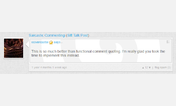
Comment boxes still have yet to be converted - the custom colors allowed there may make that hard.
This is a work in progress - input is appreciated, as CSS is not exactly my specialty.
userstyles.org@thoughtnoise.net
First install FreeStyler to use this style.
If you already installed it, please, make sure this site is allowed to run JavaScript.But you can download Freestyler for other browsers and apply styles there!
Applies to:
videosift.com