Related styles:
-
Google (search results) - widen results
Installs:Created: Jun 07, 2007Last Updated: Dec 04, 2008 -
Created: Mar 18, 2008Last Updated: Mar 19, 2008
-
Created: Jun 02, 2007Last Updated: Dec 18, 2008
-
Created: Jun 07, 2007Last Updated: Jun 08, 2007
-
Created: Jul 30, 2007Last Updated: Jul 31, 2007
-
Created: Dec 08, 2006Last Updated: Nov 09, 2008
-
Created: Jun 11, 2007Last Updated: Oct 03, 2007
-
Created: Sep 09, 2008Last Updated: Oct 28, 2008
-
Created: Jun 13, 2007Last Updated: Dec 03, 2007




Google Scholar - add filetype icon before result
Description:
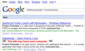
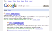
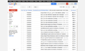
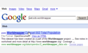
This style makes it MUCH more clear which results are books and (more importantly?) which results are DIRECT links to pdf files. (see screenshots) This makes searches infinitely more straightforward! Also, I've found that it corrects the occasional Google mistake of identifying a pdf file as a "book."
Google Scholar is a great tool, and this style further improves its usability. Best of luck with your research!!!
If you like this style, please refer to Google (search results) - add filetype icon before.
P.S. - I know that Google Scholar interacts with some universities to offer direct links to sites which that particular university has subscriptions to (a fantastic idea) - this MAY change the layout, and potentially break this style. PLEASE leave a comment if you find this to be true (or not). THANKS!
(11-03-07 - update to include additional url address)
(03-25-08 -
First install FreeStyler to use this style.
If you already installed it, please, make sure this site is allowed to run JavaScript.But you can download Freestyler for other browsers and apply styles there!
Applies to:
scholar.google.com, http://www.google.com/scholar