Related styles:
-
freestyler.ws by BamaBraves
Installs:Created: Jan 17, 2015Last Updated: Oct 06, 2018 -
Created: Apr 19, 2016Last Updated: Apr 19, 2016
-
Created: Nov 12, 2016Last Updated: Oct 05, 2020
-
Created: Oct 26, 2015Last Updated: Dec 20, 2015
-
Created: Mar 18, 2015Last Updated: Mar 18, 2015
-
Created: Dec 29, 2013Last Updated: Nov 16, 2015
-
Created: May 17, 2016Last Updated: May 17, 2016
-
Created: Nov 25, 2016Last Updated: Nov 25, 2016
-
Created: Jan 16, 2015Last Updated: Jan 16, 2015


makondo@userstyles deleted this style
Try Bing Dark instead of this deleted style.
See more styles for Bing
Bing on Glass
Description:
Min. requirements: Vista/Aero, Fx 3.6*, default theme, Glasser 3.5.2, Stylish 1.0.7*.
Used a code from Glasstube by Lottel@userstyles, thanks!
It probably will not be quite readable against dark/busy backgrounds. But you should be able to fix it by brightening text shadows and background transparency. Experiment at your own risk ;-) and post a discussion if you need help.
Sorry, it's impossible to make a decent shot under 75KB.
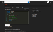
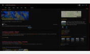
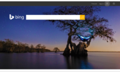
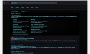
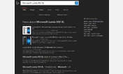
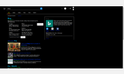
'before' - main page
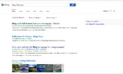
'after' - search results page
Better shots:
http://img412.imageshack.us/img412/7105/2full.png
http://img6.imageshack.us/img6/2460/fullxy.png
11/02/10 - fixed some new stuff, made the map popup transparent for consistency.
First install FreeStyler to use this style.
If you already installed it, please, make sure this site is allowed to run JavaScript.But you can download Freestyler for other browsers and apply styles there!
Applies to:
bing.com, http://www.bing.com/videos/, maps.live.com, http://www.bing.com/maps/... More »