Related styles:
-
Remove Adblock tabs from sIFR headlines
Installs:Created: Jun 07, 2006Last Updated: Jul 10, 2006 -
Created: Nov 14, 2013Last Updated: Dec 15, 2014
-
Created: Dec 11, 2009Last Updated: Dec 13, 2009
-
Created: Jan 31, 2014Last Updated: Jan 31, 2014
-
Created: Dec 11, 2009Last Updated: Dec 12, 2009


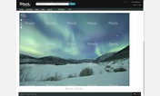

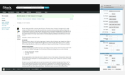

Website: istockphoto.com- better legibility
Description:
-Added more font options
-Made font size larger
-Made font slightly darker
Works with any color scheme (black and gray schemes change link color for better contrast).
--------------------------------------------------------------------------------------
updated 30-04-2009- Orange button color fix
updated 06-02-2009- Complete rewrite for CSS reboot
updated 07-01-2009- removed unneccessary classes, added alternate row colors for portfolio pages and gray scheme link colors
updated 18-11-2008- compacting of file detail page
updated 26-06-2008- minor tweaks
updated 30-05-2008- minor tweaks
updated 26-05-2008- to reflect changes with site subscriptions
updated 19-03-2008- some tweaks and fixes to inputs
updated 12-10-2007 tweaks for the new "print" tab, and nicer buttons and inputs
updated 20-08-2007 more fixes for the beta bar
updated 16-08-2007 to work with the new beta search bar.
updated 06-07-2007 for eeeeven
First install FreeStyler to use this style.
If you already installed it, please, make sure this site is allowed to run JavaScript.But you can download Freestyler for other browsers and apply styles there!
Applies to:
istockphoto.com, www.istockphoto.com