
Related styles:
-

Mozilla Labs -- Simplified
Installs:Created: Sep 11, 2010Last Updated: Sep 12, 2010 -
 Created: Aug 27, 2016Last Updated: Feb 23, 2017
 -
 Created: Sep 04, 2015Last Updated: Sep 04, 2015
 -
 Created: Dec 09, 2011Last Updated: Dec 10, 2011
 -
 Created: Feb 11, 2014Last Updated: Feb 12, 2014
 -
 Created: May 31, 2012Last Updated: Jun 01, 2012
 -
 Created: May 21, 2011Last Updated: Jun 08, 2011
 -
 Created: Feb 10, 2014Last Updated: Feb 11, 2014
 -
 Created: Dec 09, 2011Last Updated: Dec 10, 2011

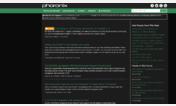
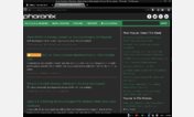
Phoronix -- Simplified
Description:
What it does:
* Hides the ad at the left side of the page
* Hides the ad in the "leaderboard" at the top of the page
* Hides the headers of the various sections at the right of the screen.
* Hides the background image, which looks awful in 16-bit color depth.
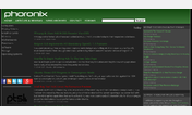
What it does not do:
* Hide the ad at the bottom of the page -- hiding this with CSS would hide the copyright notice.
* Hide the ad at the right side of the page -- hiding this with CSS would hide the recent stories and many other useful things.
This is version 1.0. I may later rearrange parts of the site as I did with my "Kerneltrap -- Simplified" style (22730)
First install FreeStyler to use this style.
If you already installed it, please, make sure this site is allowed to run JavaScript.But you can download Freestyler for other browsers and apply styles there!
Applies to:
phoronix.com