Related styles:
-
The Escapist Magazine cleaned up
Installs:Created: Jan 13, 2008Last Updated: Jan 14, 2008 -
Created: Oct 19, 2008Last Updated: Oct 20, 2008
-
Created: Aug 12, 2012Last Updated: Aug 13, 2012
-
Created: Dec 09, 2007Last Updated: Dec 10, 2007
-
Created: Oct 24, 2010Last Updated: Oct 25, 2010
-
Created: Mar 01, 2012Last Updated: Mar 02, 2012
-
Created: Jan 02, 2011Last Updated: Jan 03, 2011
-
Created: Feb 10, 2012Last Updated: Feb 11, 2012
-
Created: Jul 17, 2012Last Updated: Jul 18, 2012




Remember The Milk - bigger text, no cow
Description:
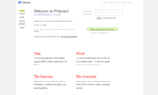
* Byeeee, cow logo!
* Font family changed to arial which is more comfortable for me;
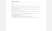
* Font-size for the list of tasks have been increased to make them more visible (or more web2.0-ish if you like). Anyway, those small default font-sizes are dull.
Let's name it "RTM Hacks v.0.1".
Best served with:
- Remember The Milk TinyHeader
- Remember The Milk - display keyboard shortcuts
=== 2008-03-31, rev.2:
* Task name is on the new line.
* Checkboxes are aligned to the top of the rows, making them more aligned with the first line of the task. (Tags get in the way, but I don't know what exactly to do with them — it's a choice to either align checkbox to normal text or to tag text, and it's tough to decide.)
=== Discussion: http://www.rememberthemilk.com/forums/tips/4236/
First install FreeStyler to use this style.
If you already installed it, please, make sure this site is allowed to run JavaScript.But you can download Freestyler for other browsers and apply styles there!
Applies to:
www.rememberthemilk.com