Related styles:
-
Created: Sep 22, 2011Last Updated: Sep 16, 2013
-
Created: Sep 24, 2010Last Updated: Sep 25, 2010
-
Created: Nov 12, 2014Last Updated: Feb 18, 2017
-
Created: Jun 13, 2015Last Updated: Jun 13, 2015
-
Created: Oct 06, 2015Last Updated: Oct 16, 2020
-
Created: Dec 05, 2014Last Updated: Jun 30, 2015
-
Created: Apr 01, 2014Last Updated: Apr 01, 2014
-
Created: Mar 26, 2014Last Updated: Mar 26, 2014
-
Created: Jul 09, 2016Last Updated: Jul 09, 2016


hackito@userstyles deleted this style
Try Make Batoto more friendlier to read manga instead of this deleted style.
See more styles for Mangafox
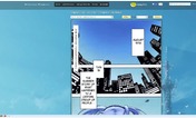
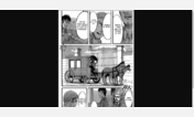
MangaFox' manga (with more space)
Description:
This style looks fine in both Fx 3.6 and Fx 4 (Beta 3) for me. Let me know if it doesn't for you (in the comments).
*Chrome users*
If it says that is not compatible with Chrome, try creating the style manually:
1. Go to Stylish and click on "Add New Style"
2. Click on "Show code" in this page (below)
3. Copy the code shown into the Stylish textareas
* Each @-moz-document segment is a Section, so it has two sections
* After each "Paste", you must select what (URL) does it apply to
- This is given by the value after "@-moz-document", it can be a domain or the beginning of the URL
Note: Most only apply to "mangafox.com/manga/".
Change log (not updated anymore):
10/09/10 - removed XUL namespace seeking compatibility with G Chrome.
9/17/10 - bottom: hidden the legend from the scans, and added the option to hide the controls (at the bottom).
8/11/10 - r
First install FreeStyler to use this style.
If you already installed it, please, make sure this site is allowed to run JavaScript.But you can download Freestyler for other browsers and apply styles there!
Applies to:
mangafox.com, http://www.mangafox.com/manga/, http://mangafox.com/manga/