Related styles:
-
no image at all
Installs:Created: May 23, 2008Last Updated: May 24, 2008 -
Created: Apr 11, 2008Last Updated: Jun 28, 2008
-
Created: Jan 26, 2010Last Updated: Jan 27, 2010
-
Created: Apr 08, 2008Last Updated: Apr 13, 2008
-
Created: Apr 04, 2008Last Updated: Apr 05, 2008
-
Created: Mar 21, 2008Last Updated: Mar 22, 2008
-
Created: Mar 23, 2010Last Updated: Mar 24, 2010
-
Created: Apr 07, 2008Last Updated: Apr 08, 2008
-
Created: Apr 14, 2009Last Updated: Sep 08, 2010






pto2k@userstyles deleted this style
Try no image at all instead of this deleted style.
See more styles for Google
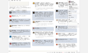
Google Reader 2 Columns
Description:
Updated to work in Chrome.
Customization for your taste:
1.To fit the post in your screen size, you may need to modify the ‘height' value in .item-body section.
2.To change the column width, modify the value of '-moz-column-width' and/or '-webkit-column-width'
One thing (on Chrome):
the images in posts are scaled down to fit in the column
but it's not so good for comic posts that only has one big picture, say Dilbert...
so i added a hover event to the image to make it show in actual size when moused over
but it seems the image will be clipped by the width of the column.
anyone has idea to fix this please help
First install FreeStyler to use this style.
If you already installed it, please, make sure this site is allowed to run JavaScript.But you can download Freestyler for other browsers and apply styles there!
Applies to:
http://www.google.com/reader/view/, https://www.google.com/reader/view/