Related styles:
-
Drupal - Obsolete
Installs:Created: Oct 15, 2010Last Updated: Oct 16, 2010 -
Created: Jan 25, 2011Last Updated: Jan 26, 2011
-
Created: Oct 16, 2010Last Updated: Oct 18, 2010
-
Created: Oct 17, 2010Last Updated: Oct 18, 2010
-
Created: Sep 15, 2016Last Updated: Sep 15, 2016
-
Created: Oct 12, 2008Last Updated: Oct 13, 2008
-
Created: Oct 12, 2008Last Updated: Oct 13, 2008


DMOZ*Ergo - Little tweaks for easier navigation
Description:
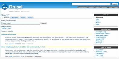
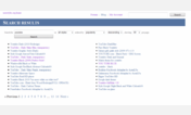
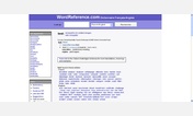
Main changes :
- Lines under links removed to facilitate reading
- Bigger search area (+ colored)
- Blocks more clearly separated
- Languages block limited in height
- Various small tweaks...
The *Ergo collection aims at improving usability without touching what makes the « soul » of websites. So no radical changes, website is still recognizable at first sight. You can find more *Ergo styles by clicking on my name up there.
First install FreeStyler to use this style.
If you already installed it, please, make sure this site is allowed to run JavaScript.But you can download Freestyler for other browsers and apply styles there!
Applies to:
dmoz.org