Related styles:
-
Myspace 2.0 new style.
Installs:Created: Jun 21, 2008Last Updated: Jun 23, 2008 -
Created: Dec 01, 2007Last Updated: Oct 03, 2009
-
Created: Jul 11, 2008Last Updated: Aug 20, 2008
-
Created: Feb 15, 2008Last Updated: Feb 24, 2009
-
Created: Apr 04, 2007Last Updated: May 12, 2008
-
Created: Nov 01, 2010Last Updated: Nov 02, 2010
-
Created: Apr 29, 2009Last Updated: Mar 15, 2010
-
Created: Nov 11, 2007Last Updated: Nov 16, 2008
-
Created: Jul 03, 2008Last Updated: Aug 16, 2010









Toothpick Guy@userstyles deleted this style
Try Myspace 2.0 new style. instead of this deleted style.
See more styles for Myspace
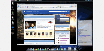
MySpace New Skin Style View More Pics
Description:
Others in the series:
MySpace New Skin Style Comment Page
MySpace New Skin Style Photo Album
MySpace's default picture browsing pages are really ugly. I got fed up with the ickyness and decided to stylesheet it. This styles the page like the new home skin. The new home design is pretty spiffy, so I thought I'd go with that style. I soon found out that MySpace's CSS and table code is atrocious. I managed to get a decent looking skin going, though. So enjoy!
I can be found on deviantART if you want to talk to me about it - http://toothpick-guy.deviantart.com/
I'll be making a stylesheet for a few other ugly MySpace pages, so check back every once in a while. :)
First install FreeStyler to use this style.
If you already installed it, please, make sure this site is allowed to run JavaScript.But you can download Freestyler for other browsers and apply styles there!
Applies to:
http://viewmorepics.myspace.com/index.cfm?fuseaction=user.viewPicture&friendID=