Related styles:
-
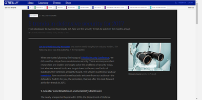
oreilly.com dark theme
Installs:Created: Feb 26, 2017Last Updated: Feb 26, 2017 -
Created: Nov 21, 2007Last Updated: Nov 21, 2007
-
Created: Feb 25, 2012Last Updated: Feb 26, 2012
-
Created: Jan 06, 2008Last Updated: Jan 07, 2008
-
Created: Jun 21, 2011Last Updated: Jun 22, 2011
-
Created: Dec 17, 2009Last Updated: Dec 18, 2009
-
Created: Dec 22, 2014Last Updated: Dec 22, 2014
-
Created: Jun 19, 2008Last Updated: Jun 20, 2008
-
Created: Aug 02, 2006Last Updated: Aug 11, 2006


Simpler Safari Books Online (O'Reilly)
Description:
Also, I removed the navigation for O'Reilly, if you want that back, remove #headerNavigation > tbody > tr:first-child from the script.
Another darn problem I kept having was that the next-page links were too small and the pages felt hard to read from lack of white space. So I increased the size of the left and right bars, solving both problems in one go.
First install FreeStyler to use this style.
If you already installed it, please, make sure this site is allowed to run JavaScript.But you can download Freestyler for other browsers and apply styles there!
Applies to:
safari.oreilly.com