Related styles:
-
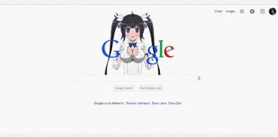
Google Hestia (Anime) version
Installs:Created: Apr 18, 2015Last Updated: Apr 22, 2015 -
Created: Jan 25, 2016Last Updated: Feb 22, 2017
-
Created: Dec 06, 2012Last Updated: Sep 08, 2015
-
Created: Sep 03, 2016Last Updated: Feb 21, 2017
-
Created: Jan 29, 2015Last Updated: Feb 24, 2016
-
Created: Jul 25, 2014Last Updated: Mar 08, 2017
-
Created: Feb 18, 2014Last Updated: Jan 28, 2016
-
Created: Feb 22, 2012Last Updated: Feb 09, 2015
-
Created: Feb 02, 2015Last Updated: Feb 24, 2016

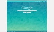

GMail 2.0 Redesigned - Grays and Blues
Description:
Thanks guys!
A compilation of designs and tweaks (thanks to Paulfox and lan @ userstyles.org, marteau @ userscripts.org, and countless others (who I just can't remember, but appreciate) from whom I snipped bits of code).
This is my first style. I'm not a programmer, and my code might not be consistent, so please be kind. ;-)
A larger version of the screenshot: http://img245.imageshack.us/img245/6121/gmail3uq8.png
Specifically, here is a list of all the items this style will change:
* Default font is changed to Segoe UI, Tahoma, or Verdana.
* Background for interface (not individual messages) is changed to light gray.
* GMail logo is replaced by one which does not have the Beta graphic.
* Storage info/usage is moved to the top right.
* Buttons are rounded and are light gray, with yellow hover effect.
* The blue line below t
First install FreeStyler to use this style.
If you already installed it, please, make sure this site is allowed to run JavaScript.But you can download Freestyler for other browsers and apply styles there!
Applies to:
mail.google.com