Related styles:
-
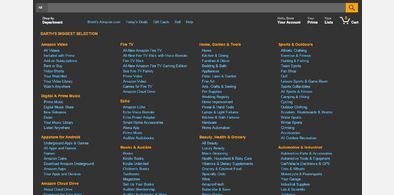
Amazon Dark - VisualPlastik
Installs:Created: Aug 10, 2011Last Updated: Feb 28, 2017 -
Created: Aug 24, 2011Last Updated: Aug 25, 2011
-
Created: Nov 14, 2013Last Updated: Dec 15, 2014
-
Created: May 16, 2011Last Updated: May 17, 2011
-
Created: Jan 17, 2012Last Updated: Jan 18, 2012
-
Created: Jan 17, 2012Last Updated: Jan 18, 2012
-
Created: May 09, 2016Last Updated: May 11, 2016
-
Created: Oct 27, 2013Last Updated: Oct 28, 2013
-
Created: Feb 11, 2011Last Updated: Feb 11, 2011


Gawker Dark with Improved Comments - VisualPlastik
Description:
More info
First install FreeStyler to use this style.
If you already installed it, please, make sure this site is allowed to run JavaScript.But you can download Freestyler for other browsers and apply styles there!
Applies to:
gizmodo.com, lifehacker.com, kotaku.com, gawker.com... More »