
Related styles:
-
cleverbot minimalistic dark
Installs:Created: Mar 29, 2011Last Updated: Mar 30, 2011 -
 Created: Feb 24, 2011Last Updated: Feb 25, 2011
 -
 Created: Feb 27, 2011Last Updated: Mar 29, 2011
 -
 Created: Mar 02, 2011Last Updated: Mar 03, 2011
 -
 Created: Mar 02, 2011Last Updated: Mar 03, 2011
 -
 Created: Mar 14, 2011Last Updated: Mar 15, 2011
 -
 Created: Mar 02, 2011Last Updated: Mar 03, 2011
 -
 Created: Feb 27, 2011Last Updated: Feb 28, 2011

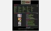
Colourful ChosenSpace
Description:
More info
update: moved top and bottom bar into sliders when fixed position chosen. (hopefully now fixed for chrome too?) rounded corners are less round too. also added them to the options if you don't want them at all.
update: different scan grid colours. added rounded corners to options.
update: fix for infobox (used in ion trail script) and fixed an error for the navigation computer. it applied the nav computer style to more than it should.
update: ups, small cursor bug resolved. sorry.
Update: Moved Options to be made on userstyles itself. no more editing yourself.
Pro: you get easily to choose what you want (from the given options ;) - more options can be requested by you. just send me a message on the forums, or meet me in the hub irc.
Con: you won't be able to update it any more. to update it you have to remove the style and reinstall it.
-------------------------------------------------------------------------------------------
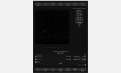
Important Notice about missing map Grid:
1) if you want to restore it, open up the stylish control panel where you manage your userstyles. find the "Colourful ChosenSpace" Style and hit the "Edit" Button.
2) a new window popped up with the style code itself.
3) skip (or read) the first block which is commented out. you then come to a "@namespace" line and another @-line. skip them.
4) Read carefully the next comment block, titled: "OPTIONAL SETTING:"! to restore the map Grid, please follow the instructions in this comment block.
5) there is now another optional setting to be found just below the top one. it alters the size of the login captcha image.
-------------------------------------------------------------------------------------------
UPDATE:
custom cursors changed (all are now slightly transparent inside) and added a new cursor for the map hovering.
map changed non-visible to users, but the grids are now directly adjacent, without the one pixel border they had before.
top bar buttons moved to fixed position on the left.
bottom bar buttons moved to fixed position on the right.
pruned old code added in the past only to fix some userscript, which is now obsolete.
various smaller changes and code improvements.
all screenshots updated with greasemonkey disabled ;)
UPDATE:
added custom cursor for CS
changed background colour for text inputs
hover effect shiny border size reduced
maybe some other small improvements i forgot about.
UPDATE:
fixed 'go to page' text display for chrome users. firefox users won't see any difference but a slightly bigger clickable area for the board threads.
the complete style should now be chrome compatible. be aware that i might not be so fast in fixing chrome specific bugs as ff specific bugs. thanks.
UPDATE:
fixed go to page links on insanely long threads.
gave 'post' link same appearance as the reply link and gave them both a different colour.
UPDATE:
fixed board links issues. fixed textarea issues for chrome (should now be resizeable again)
minor board improvements: board titles less outstanding, 'more' removed (click board title, which does just the same)
UPDATE:
login image made bigger. see above for how to restore the original size.
changed appearance for one of my own scripts (message scan roid one).
minor bugfixes, but some board links still buggy. will fix them when i find time.
UPDATE:
fixed issue with faction boards & minor fix for display issue while attacking another ship.
UPDATE:
i forgot to change the colours of the board title hover & more & post links to the rest of the hover button style. geez ...
UPDATE:
removed the black background colour on link hovering.
made the links look more consistent. for the pro's: i did give them only a '0px 1px' padding instead of the previous '0px 3px 0px 5px' one.
the disabled buttons do not only have a reddish shadow, but also the link colour is red now on hovering.
the buttons also got the normal link colour for the text on hovering. i am not sure if this one makes sense. time will tell. and your feedback ;)
UPDATE:
normalized the report link.
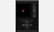
added finally some before/after screenshots (sector view - i do not really care if you know my low credit stash, my nearly non-existent points, or my whereabouts - just be nice to me ;)
UPDATE:
ups, i messed up the line height on the boards. now it works well again.
oh, and i changed back the captain links to their original colour. the blueish one did not suit my eyes.
UPDATE:
fixed some display issues for use with the nicer ship pages script & the direct jump form script. those fixes should not affect anything present without those two scripts. let me know if it causes troubles with another addon. if so, send me a link to the addon, or the addon script. i will fix it then.
Initial info:
there are a lot of changes made, some are still not 100% fine, but in time i hope i can make it truly nice.
a word of notice: if you miss the map grid, please edit the style yourself. only edit it and you should be able to restore the grid again. i recommend commenting it out only, so if any time you feel like 'i do not want that grid any more' you can change it back easily.
the grid is by default off, but if enough people insist to have it enabled by default i can do just that.
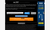
First install FreeStyler to use this style.
If you already installed it, please, make sure this site is allowed to run JavaScript.But you can download Freestyler for other browsers and apply styles there!
Applies to:
chosenspace.com