Related styles:
-
4chan dark minimal reborn
Installs:Created: Mar 05, 2011Last Updated: May 19, 2012 -
Created: Jul 03, 2012Last Updated: Jul 13, 2012
-
Created: Jan 25, 2014Last Updated: Jan 26, 2014
-
Created: May 16, 2012Last Updated: Nov 16, 2016
-
Created: Sep 18, 2011Last Updated: Feb 28, 2013
-
Created: Dec 03, 2009Last Updated: Jan 04, 2015
-
Created: Aug 17, 2015Last Updated: Aug 17, 2015
-
Created: Apr 02, 2016Last Updated: Apr 02, 2016
-
Created: Mar 29, 2017Last Updated: Mar 29, 2017

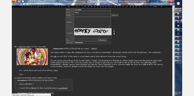







4chan Slideout, Floating Postbox
Description:
Should work fine with other styles, providing they don't screw too much with the postbox themselves.
More info
10/3/2011
** Added a slight delay to the slide-back-in of the postbox, because it's irritating to accidentally overslide the mouse and have the postbox go back all the way in.
** Added some hacks to out-prioritize other styles where applicable. This makes this "style" compatible with Saxamaphone@userstyles's 3 Shades of 4chan. The only incompatibility is that the file box will be 2px longer than other input boxes. I just wanna make a small note: It is very hard to out-prioritize Saxamaphone@userstyles's CSS, and very fun to succeed in doing so. :D
** Removed transparent background and custom coloring from the textboxes. This should make it more compatible with other styles.
** Added some styles I quickly tested this with. Anything I threw at it that didn't already have a floating postbox ( 4chan 〜 Momiji ) worked fine.
** Removed lingering code from my other styles that found it's way into this one that was no longer relevant (fake margins, mostly). :D
11/3/2011: Fixed post form inconsistencies, mostly with the file box and submit button, switched from using margins as a way to move the post for to using positioning because positioning feels less hacky. Also, apparently I just learned how to use the :not() selector. :not(:hover) means I now have a solution to what the hell to do with the Spoiler Image? checkbox/label. I have to give full credit to !K.WeEabo0o@userstyles for this one I saw it in his 4chan 〜 Momiji and had to figure out how to implement it. Ironically, his slide out post form was also the inspiration for mine (though mine uses none of his code. Our ways of going about what we've done and our implementations are very different.).
13/3/2011: Fixed an oversight which disabled selecting the file input field via tab select. Also applied fixed positioning to 4chanplus's Autonoko feature.
15/3/2011: Browse button shows up on Firefox now, no longer styles Quick Reply now (was never meant to, happens when I copy CSS from one of my styles to the other. :/)
22/3/2011: Compatibility fix for 4Chan Zenburned Compact#.
2/4/2011: Compatibility fix for styles that hide the postarea div.
13/6/2012: Compatible with new 4chan HTML. Please report bugs or weird behavior.
Special note: Because I cannot guarantee that this style will look good when paired with other styles, I have added some configuration options to the top of the style that are self-explanatory. If the post forms colors don't sync up properly, feel free to mess with these options. PROTIP: These options will not fix everything. There are some styles this one just WON'T work with without hacking together both styles.
First install FreeStyler to use this style.
If you already installed it, please, make sure this site is allowed to run JavaScript.But you can download Freestyler for other browsers and apply styles there!
Applies to:
4chan.org